
Flash. Your screen glows. A visitor lands on your site — heart pounds, eyes dart. What grabs attention? Color.
Does that sapphire-blue button whisper “trust”? Does a punchy red badge demand, “Act now!”?
Meet Sara. She owns Café Verde, a local roastery. She switched her site’s palette from muddy brown to leafy green and crisp blue. Within weeks, sales climbed. The bounce rate tumbled. Visitors said it “felt fresh.” Did those colors shift behavior?
Ever ask what colors attract customers to a website? Or how do different colors influence buying decisions? Why did green feel trustworthy and red trigger action? Why did blue build brand credibility?
This scene proves the pull of the psychology of colors in branding and web design. Let’s crack 11 real-world hacks.
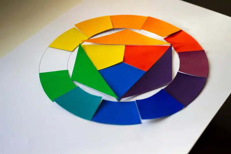
1. What Colors Attract Customers to a Website?
Visual Salience of Warm vs. Cool Tones
Red screams. Blue calms. Yellow pops. Want people to look? Color works faster than words.
Zhou and Oh (2025) agree. People judge a warm-looking app faster than a blink. They ran a slick online test with 187 individuals, showing them app designs with either rounded or sharp corners. The curvier ones felt warmer, friendlier—even beautiful. That warm fuzzy feeling? It made people more likely to donate extra cash in the app.
So yes, shape and warmth mess with your brain… in good ways. What else is your interface whispering to users?
Emotional Triggers Via First Impressions
Use warm for alerts. Use cool for comfort. Think: red badges, blue menus. Purple? It’s the middle ground. Royal. Calm. Strong.
Color Trick: Use red only where action matters.
Mood Hack: Greens and blues chill visitors into exploring more.
2. How Does Color Choice Affect Brand Perception?
Your brand feels a certain way. Color writes that script.
Green or Eco-Focus, Red for Urgency
Labrecque et al. (2024) ran seven lab studies with over 2,700 people—and even scraped the web and ran a field test. What did they find? People think brighter, bolder colors mean stronger, better products. More saturation? More trust. Even the background color in ads changed how effective things felt.
But here’s the kicker—when people wanted something gentle, too much color made it feel harsh. So, use red for urgency and green for health, but tone it down if you’re selling baby lotion.
Café Verde switched from brown to green and blue. Suddenly, it felt organic. Fresh. Kind.
Tone Tip: Match color to your values.
Feel Filter: Don’t pick colors you like. Pick ones that speak for your brand.
3. Which Colors Increase Conversion Rates in Web Design?
Want more clicks? Change your button’s color.
Quantified Conversion Lifts
The Forbes Expert Panel (2025) yelled it loud—your CTA better pop. If that button blends in, it’s a snooze-fest. They said brands using high-contrast colors saw way more clicks.
Red? Urgent. Green? Perfect for nature-y brands. Blue? Trust central. Dull buttons are quiet buttons. Loud ones get pressed.
The psychology of colors in branding and web design tells us: color + context = conversion.
Action Hack: Test two button colors. See what wins.
CTA Tip: High contrast beats pretty palettes.
4. Why is Color Psychology Important in Branding?
Color sticks. Fast.
Emotional Resonance Metrics
Zhou et al. (2025) ran seven slick studies—some in labs, some in the real world—and found that low color saturation made luxury brands look way more high-status. Why? Faded tones felt “older,” more heritage-rich.
And guess what? That fancy old vibe made people willing to pay more. So yes, sometimes less (color) is luxe.
People remember feelings. Color delivers them first.
Brand Lock: Use one bold main color across everything
Recognition Rule: Never mix tones across platforms